Friday, 25 February 2011
Pitching the theme....

Wednesday, 23 February 2011
Imagining The Exhibition.....
Looking At The Exhibition Space....
We're antipating the walkway that leads through from the vending area being the primary entrance to the exhibition area........

The ceiling in this space lends itself to the underground theme as it has a slightly curved aspect similar to the underground tunnels.....

Calling Card Samples....
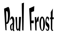


Vintage Text Fonts....
Personal Branding Inspiration....
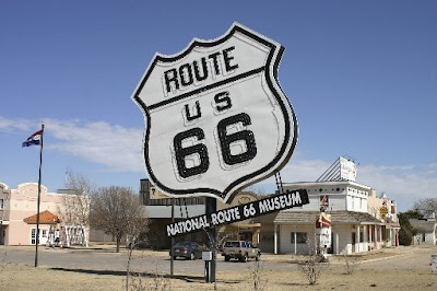
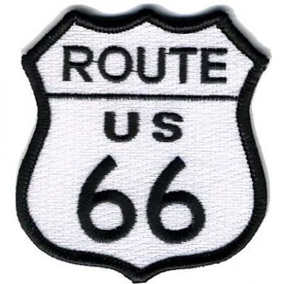
There are common themes running through Hod Rod Kulture including chequered flags, airbrushed flames and pinstriping. Colour palletes typically include primary Yellows, Reds, Blacks and Whites.

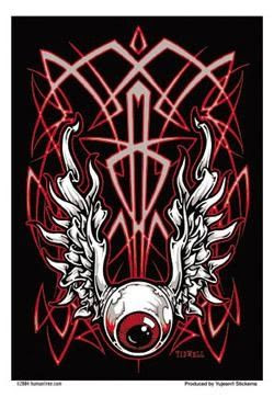
To make my calling cards stand out from from the crowd it would be cool to get them embroidered into a vintage themed sew on patch. This wouldn't be cheap but there are suppliers that have computer controlled embroidering machoines so it is possible.
Friday, 4 February 2011
Mood Board.....
The underground map could be used as inspiration for a colour theme with a maps key giving the students name and allocating them with with a colour. A line could then be taped onto the floor to lead to thier work. The background of their work would also be colour coded.
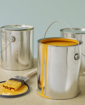
Paint pots could be left to dry and made to look like the lines had been painted or just ran out of the pots.
Tube stations and slogans could also be used to continue the theming.
Another theme could be shapes......
Maybe a large cube supended from the ceiling with images printed onto each side? A large sphere could have images projected onto it distorting the images into intersting shapes.
Rich suggested an abstract design, that also be quite mind altering... Instead of just decorating the walls, you could do the ceiling and floor?
Tuesday, 1 February 2011
Museum Visit......
I researched what the current exhibitions in London were and decided to visit the Gabriel Orozco exhibition at the Tate Modern as his works looked very appealing.
The exhibition guide reads..... Gabriel Orozco's art belongs to an age in which people, images and commodities are no longer rooted in a single geographical location, but are continually on the move.
Even as I approached the Tate Modern, striking posters advertising the exhibition were placed some distance away from the building. These were to bring in 'passers by' who may be teased by the image and poster. One of Orozco's signature pieces, the 'Black Kites' skull was being used as branding and was a theme carried through all the promotional items.
You couldn't really lose track of where his work was being displayed as even the 'signposting' carried his name.
Me outside the entrance to the exhibition
A series of nine adjacent square and rectangular rooms had been acquired for the exhibits. The walls were all white washed and the floor was a light coloured polished wood.
Lighting was provided by the museums flexible ceiling grid and rail system meaning the curator Jessica Morgan alongside Orozco, could light the works to their best effect. Generally speaking, there was a soft ambient light being used along with spotlights directly lighting some of the pieces.
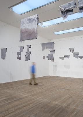
Lintels 2001
An introduction to the artist and the exhibition was the first thing you see as you enter. This introduction and the details of each work adjacent to the piece were not mounted on boards but had been directly transferred to the wall in mid grey print.
Some works had been grouped in themes whereas others were presented individually to increase their impact.
One piece of work that was particulary interesting from an exhibition point of view is Chicotes 2010. This is a work of tyre fragments collected by Orozco along Mexican highways for years. The pieces are then laid out according to the individual space they are to be exhibited in. This means that the work as it appears in New York for instance would differ from the London piece.
Another piece, 'Carambole With Pendulum' 1996 engaged visitors by nature of the way it could be interacted with. Orozco had taken a French version of Billiards played on a table with no holes and substituted the regular rectangle table with an oval. A red ball is suspended from the ceiling on a thin wire and once swinging, just skims the tables surface.
Snooker cues are provided so visitors can try their hand at the game making up their own rules.
After leaving the exhibition, I visited the gift and book shop. Both had Orozco related items on sale including books, t-shirts and postcards. The gallery had made maximum use of the exposure and had placed the merchandising right at the entrance to the shops.
Communication of the message:
The fundemental point of any exhibition is communicate a message. This can be achieved with images, sound, lighting, arifacts or more usually a combination of them.
The 'message' is of course subjective and what means something to one visitor may mean something completely different to another.
From a purely personal point of view, the principal message Orozco's work conveyed to me was that of how he interacted and modified his environment by taking everyday out of their natural context. This was achieved by altering them sometimes subtly but more often radically which gave them a completely different purpose.
The layout, exhibits and lighting made the exhibition an enjoyable place to be and I really enjoyed my visit. Although I don't have a smartphone, the gallery had provided an interactive guide which would of bought each piece to life a little more.
This was available at www.tate.org/go/orozcomobile.
Further information on the artist and exhibition can be found at: http://www.tate.org.uk/modern/default.shtm
Brainstorming....
I brainstormed a few ideas with my group and added more myself.....


